Are your emails mobile friendly?
Roughly a 4 minute read by Jamie Wright

There are still very few better ways to get your message in front of your customers than a good old e-shot or newsletter. Now this isn‘t exactly groundbreaking news, and you’re probably already well–versed in the whole subject – but there has still been some great progression recently around how emails are designed and built, aimed to address the huge shift away from desktop and towards mobile consumption.
I’m sure you’ve heard of the term “responsive” thrown around when talking about websites, but did you know you can also use that same technique for your emails too?
Re·spon·sive de·sign (noun)
A collection of techniques, such as media queries, fluid grids, and fluid images, which aim to provide the optimal viewing experience across various platforms.
It’s not quite the same (or as advanced) as on the web though. With email being a little slow to catch up with the latest and greatest technologies, you still need to know how to code like you‘ve gone for a ride with Marty Mcfly and the Doc back in time, but there is massive potential that can be unlocked by giving your emails the responsive twist!
At Engage HQ, no email gets sent out without being thoroughly tested via our tool of choice, Litmus. Here are some figures they recently published which you may find surprising:
Email opens in 2013
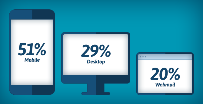
- At 26%, more emails are opened on an iPhone than any other device – and we’re including desktop computers here!
- 80% of people delete an email if it doesn’t look good on their mobile.
- People look at their phones on average 150 times per day.
Figures like these make it hard to argue that investing in how your email will look on mobile as well as desktop is time and money well spent – especially when you're reaching out to tens of thousands each time you press 'send'.
So what‘s possible?
Without sounding too scary, you can use Media Queries and percentage grids to create layouts that will look great on a variety of email clients, regardless of type; be it your computer at work or your grandma’s emergency mobile (maybe). Here are a few quick tips to get you started:
- Rearrange your content – eg. 3 columns on desktop could become 1 single column on mobile).
- Hide and show content – eg. showing your full list of categories in your nav on desktop but just your main 2 on mobile.
- Change font size, colour etc – sometimes you might want larger font sizes on mobile to help legibility.
Consider in situ
One of the biggest things to consider when it comes to designing for mobile interaction, and this isn’t anything groundbreaking, is that the user isn’t using a mouse, but their finger (or thumb). This impacts on a few things, the biggest is your call to actions, if you‘re got a text link then it‘s got to be big enough for someone’s chubby mits to press without getting frustrated.
If you’re going to go single column on a mobile then a width of about 500px usually works best from a readability point of view, this will probably mean that you need to up your font–size for mobile too as your customer is more than likely an arms length away from their phone. While we’re at it, remember that there is still a browser frame on mobile devices, so you’re not getting the full viewport, so don‘t make a school boy error of placing your main call to action button a scroll of the thumb away!
What is this going to work on?
There is a full comprehensive list here of the email clients that support media queries for mobile friendliness, but here are the most important ones:
Clients that do support media queries:
- iOS Mail app
- Android 4.x Email app
- Windows Phone 7.5 mail app
Clients that don’t support media queries:
- Gmail (mobile & desktop)
- Mailbox app
- Outlook
- Yahoo Mail app
So when you could be giving a mobile friendly experience to just the iOS mail app, that’s still over ¼ of your audience!
Should your next email be mobile–friendly?
Related resources
- Content Choreography In Responsive Email
- Average Responsive Email Design
- Guide To Mobile Email
- Email Marketing Trends
- Mobile Email Compatibility Guide
- Email Client Market Share
- How To Guide To Responsive Email Design
- Responsive Email Support
- How Does Mailbox App Render Responsive HTML Emails
Unrelated: This blog post may or may not have been fuelled by #BEER.