Back to the Future of Web Design
Roughly a 6 minute read by Adam Buchanan
From fashion trends to the latest crazes, it’s safe to say that at some point during our blunderyears our parents chirped in on how these newfound identities were nothing new.
Although their age-old lore was tough to stomach and often seen as an attack on what we considered to be our own, we’ve hit that time of our lives where we need to admit defeat. While the mullet might not have quite returned to our heads just yet, the vibrant hues, crisps shapes, and illustrative styles of both the eighties and nineties have begun finding a way back into design today.
To gain an understanding behind both graphic design of the 1980s and the influence it has had on web design as of late requires a short adventure back in time.
Rebelling against the rules
During the early 1980s a group of furniture and product designers led by Ettore Sottsass decided to present a two fingered gesture towards the design standards present in the industry at the time. Under the newly formed Memphis name, their creations broke away from all conventions by introducing striking colours, harsh geometric shapes and kitsch elements that nobody ever dared touch. This included garish red upholstery with clashing yellow legs, portable multicoloured lighting on wheels, and shelving units which could easily pass as being mismatched Lego sculptures from our childhood.

Photo via MEMPHIS-MILANO DESIGN 1981-1987
The emergence of this style soon became a marmite-affair, with older generations hating the trend and younger ones embracing it. Regardless of anyone’s views the postmodernist approach Memphis helped create was here to stay. It provided a completely fresh approach for budding designers to make themselves stand out - whether or not these neon colours and accompanying styles were welcome.
Although sounding nothing more than a justification for hipsters being who they are, the desire by individuals to be different is what fueled the eighties generation. This was further emphasised by the arrival of computers with Graphical User Interfaces, electronic music and synths, and even computer games too. Work and play as the last generation knew it was quickly fading. Kids were casting away their timeless static toys in favour of electronic games, and desk jobs were being equipped with state of the art machines capable of replacing typewriters. The future was here!
Rebelling against the web industry
So how exactly does this all relate to web design today? In a nutshell, it’s down to the strict rules web design has had to adhere to over the last few decades. Although evolving at an excitingly active rate since 1993, the HTML standard was somewhat rigid until the arrival of Canvas and HTML5. Previously designers were often been restricted with what could and could not be displayed within the remits of Internet Explorer 6. And Internet Explorer 7, and 8… you get the picture.
Casting aside traditional layouts and tables, web designers have finally reached an age where we too can metaphorically flip the bird at any prior frustrations whereby technology has held us back. Although frontend developers may get a little shaky with the way things are heading, recent advancements in web design have introduced full-screen video backgrounds, elements which can be placed anywhere on a page, and of course responsive design. While this all seems like general knowledge to any web designer, it’s actually the execution of these features in a combined form which has allowed us as designers to rebel. If anything though, we’re not rebelling against the rules HTML markup presents, but more the traditional look and feel we’d associate with the term ‘website’.
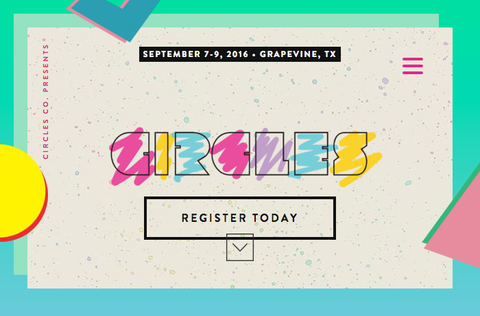
This in turn has seen designers returning to their roots and turning to a nostalgic time period where the crazy moments of their childhood are brought back into web design. Take for example the acclaimed website for Circles Conference 2016. Not only does the single page event site make use of the many new features HTML5 offers, but it pulls them off using graphical elements from three decades ago to compliment its fussiness. Despite sounding like a graphical car crash, there’s plenty to draw you in and plenty of nods to the past. Like Memphis’ postmodernist creations, this eighties inspired approach is a refreshing take on web design as we know it - and one that instantly captivates you for all the right reasons.

Another fantastic example of this movement is Spotify’s Year In Music 2015. In what appears to be a page casting aside all rules and regulations, we are given a stunning look through last year’s top hits on the digital music platform. All of this is again complimented by colour hues we’d never normally pull into our comfort zones, along with typographical treatments that dare to be bold.
Also under the neon lights...
Elsewhere across the web, one of the most influential brands born during this timeless era has made a return to where it all began. MTV as many will know provided a lot of eighties kids with musical direction and wardrobe inspiration, all through the arrival of the music video and their video jockeys. The channel featured countless influential graphics, many of which dared to break brand guidelines by reforming their own logo into different shapes, styles, and structures.
While MTV as we know it today may have since degraded into a breeding ground for woeful reality TV stars and lacklustre programmes, the executives at Viacom Media Networks have begun making amends to once again be different. An easy to spot source of their latest efforts is on Instagram. Tuning into the next generation of youth with smartphones integrated into their daily lives, MTV’s feed on Instagram is littered with clashing gradients, awkwardly unique designs and poorly cut out celebrities - all of which appealing to the millennials who have grown disillusioned with the cleanliness of other brands.

Another aspect of this movement can also be found aimed at some of the youngest media consumers around. Disney XD’s recent rebrand is effectively an insult to the company’s rich animated history and considered design, yet somehow, the colours and geometric patterns are a welcome refresh. It’s worth noting that Disney XD is more of an extension to hold their non-heritage assets, although visually speaking it’s very far from the washed out family friendly colours of Winnie The Pooh and his friends.
Truffle shuffling on!
Generally it’s safe to say that over the next few years we’ll no doubt be seeing countless brands rejuvenated through three decade old design practices. While these efforts may have modern twists to them through taking advantage of technologies available today, at its core it is nothing more than a collection of designers following in the footsteps of Ettore Sottsass.
Call it a rebellion against Google’s Material Design, Apple’s flat design guidelines, or even the traditional approach to a website if you will, either way it’s a refreshing step back into the past - and one our parents have all seen before in some shape or form.