Combining web fonts
Roughly a 3 minute read by Jamie Wright

We’ve all been there; when you absolutely love a font and you’ve dropped it into your designs, only to find out it’s missing a certain special character or the punctuation glyphs doesn’t quite capture the same feel as the rest of the character set.
This occurrence can greatly depend on where you’re sourcing your fonts from (for example: free ones!). One option is (and I’m sure it happens more often than not) to find a different font, but what if you could fix the problems? There are a variety of reasons you could want to fix/edit an existing font.
- Missing glyphs
- Positional inconsistencies of glyphs
- Kerning issues
- X-height issues
- Your design doesn’t require the full character set
“Combining” fonts
What triggered me to write this was recently enjoying an article about combining fonts by Jake Archibald. His case was similar to the scenario I mentioned above. Loving the “Just Another Hand” font but not loving the position of the hyphen & equals glyphs.
Although he calls his solution “combining fonts” I disagree. It’s a good solution to his problem but it’s not really “combining” in the truest sense of the words, at least in my eyes.
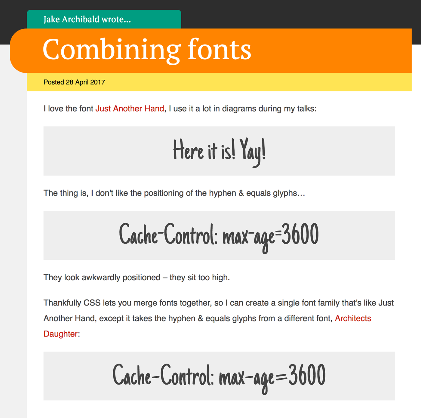
Using a second @font-face declaration alongside a unicode-range (something I’d not come across before, but looks really handy). Overwriting the glyphs you don't like with the fixed equivalents still means you’re requesting two fonts, albeit the second one is pretty tiny; Jake used the Google Web Fonts API to only return the glyphs needed (see:
streamlining your web font requests).
Really(!) combining fonts
That leads me to what we did on the year 2 version of our Elym.pics site, where we literally combined two fonts into one. Now this isn’t something that you’re going to come across every day but it never hurts to have this up your sleeve! The design we came up with used one font for the main copy and another for numbers.
The how and the why
It doesn’t take a rocket scientist to know that combining web fonts is going to be better for performance. Even when only using a single font, your file size can rapidly mount up when you’re using a variety of weights and styles.

As you can see above, we’ve overwritten the numeral glyphs of ‘Titillium bold italic’ with the ones from ‘ Avenir Next bold italic’. We did this using a great bit of software called TypeTool (at $48 it’s not free, but a bargain at less than a tenth of the cost of their fancier and more fully featured FontLab Studio software).
We managed to reduce the number of different web fonts we were requesting on page load from two to one, but this isn’t the only benefit. The overall size of the font is reduced, as we weren’t using ‘Titillium bold italic’ numerals, so before this they were just downloaded and as part of the font and then gathering dust. Likewise, with the separate request for ‘Avenir Next bold italic’; we were downloading the entire font when we only needed the numerals from it.
TL;DR
Combining fonts can reduce the number of requests on load as well as reducing the overall font size (less glyphs = a smaller file).