Designing Interactive Experiences For Generation Z
Roughly a 5 minute read by Adam Buchanan
According to Ofcom, a national survey reported that a massive 93% of 5-15 year olds used the internet in 2013. With a huge rise of youngsters being equipped with internet-enabled devices - from smartphones to game consoles - designing websites and applications with this age range in mind has become more important than ever before.
While I’m unable to find similar statistics to match that of 1996, I proudly remember dialing up to a now defunct ISP known as Red Hot Ant at the growing age of 8. Back then I’d spend the few minutes of phone-jamming connectivity I had on the likes of the Space Jam website (which hasn’t changed since then) and the countless Geocities hosted portals, shortly before finding PC games to download such as the incredible Tyrian (which was available as shareware). If I was lucky, my downloads at 2.3kbs would eventually complete - as long as my parents didn’t pick up the phone halfway through.
What’s important about my short nostalgia trip is regarding how kids use the internet and what they’re most likely to be found doing online. As we know, a large portion of time is spent on social media today - despite many not being of age to use such platforms - there will also be plenty of time spent on gaming portals, along with the exploration of fan pages representing their favourite interests.
Aside from these familiar locations, design aspiring to younger audiences exists in a much wider range of places spanning the world wide web. Take for example kids menus on restaurant websites, educational resources, and pages promoting events/exhibitions (to name but a few) for the little ones.
With these points in mind, we can almost split up the process of design for kids into two categories: designing for kids to use solely and designing for adults to use with their kids.
Finger painting this ain’t...
As of recent we found ourselves tasked with re-designing the kids pages for Whitbreads’ three key chains - Beefeater Grill, Brewer’s Fayre, and Table Table. Using recognisable assets from The Beano, Mr Men, and also Horrible Histories, it was up to us to create informative, yet visually engaging kids pages with an identity.
Although many may assume that creating designs based around cartoon characters is an easy gig, if anything it’s quite the opposite. Many of these flagship brands have requirements for use of their characters, requests that certain visual elements are not seen with others, along with various other challenging rules that need to be respected. This of course is only half of the task at hand, as with these promotions being a tie-in to a specific restaurant, we also had to accommodate their requirements too.
Without throwing our tools out of Photoshop, we struck a balance between the brief and buoyancy of each individual brand - pleasing all parties in the process. So in true scrapbook fashion, get ready to glance over a pritt-sticked collection of what we’ve been working on as of recent for the younger generation.
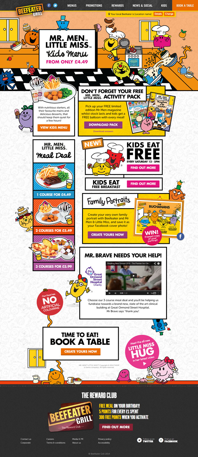
Beefeater Grill’s Kids Page: Mr Men & Little Miss

Just about everybody at some point in their lives has been amused by Mr Tickle’s reach or the clumsiness of Mr Bump. Roger Hargreaves’s creations have stood the test of time thanks to their simplistic appearances - something which translates into web design rather well.
Using the bold comic-book outlines defined by each of the characters, we were able to produce a loud page playing into its mayhemic theme. These hard edges and bright colours also provided the perfect platform for getting across the key messaging within.
Needless to say we got rather nostalgic dropping the likes of Mr Greedy and Little Miss Naughty into the design, all of which added a little more excitement to eating out as a family at Beefeater Grill.
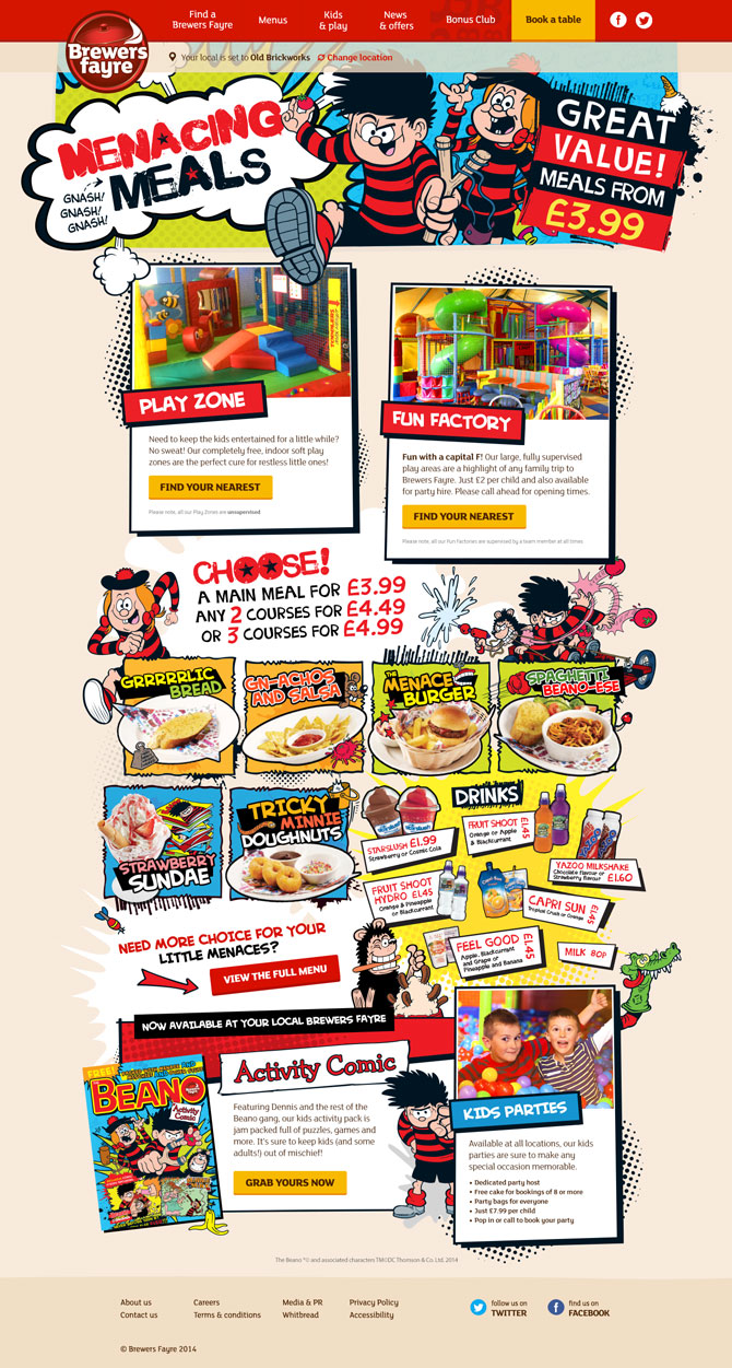
Brewer’s Fayre Kids Page: Beano

Children can be a real nightmare when it comes to eating - so what better a match than the Beano’s Dennis The Menace and co? Spanning decades of mischief and mishaps, the urban edges and paint splats of the Beano’s more recent look and feel provided a layer of impact for the Brewer’s Fayre messaging to sit on.
Using the tried and tested comic-book layout, we adapted the various calls to action and menu suggestions into something that could easily be mistaken for a page in the latest issue of the Beano.
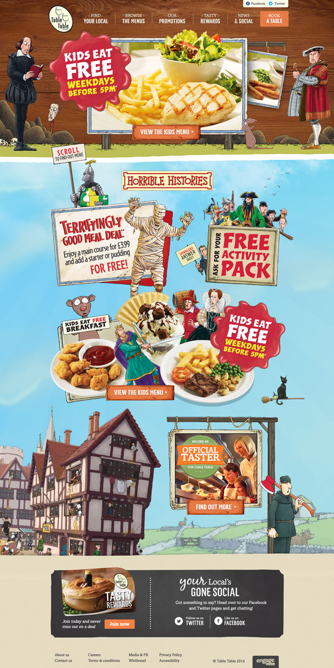
Table Table’s Kids Page: Horrible Histories

The combination of a good meal out with the kids and a splashing of historical gore might not sound like a good match at first - but Table Table’s link-up with Horrible Histories is anything but gruesome. With a more defined and sharper edge than the previous two comic styles, Horrible Histories sat rather nicely in the already elegant design of the restaurant’s new website.
Aesthetics aside, the creation of the Horrible Histories Kids page required a bit more attention to detail where its characters are concerned. Unlike Mr Bump and Dennis The Menace lining up alongside any of their buddies, the various cast members of Horrible Histories have limitations on who they can sit beside. As much as we wanted to have Ghengis Khan fighting off an army of Astronauts riding a dog-driven Roman carriage, it’s only fair the kids of today get taught about the past correctly - all whilst tucking in to a good meal.
What's next for the youthful lot at Engage?
Understandably we’ve had a good bit of fun breaking out of the box and adding a bit of menace to our designs, but this isn’t all we've had in development for the kids. Be sure to check out our thrilling throwback to yesteryear with a make-your-own-family app featuring some familiar faces.