10 Sass (SCSS) mixins you should be using in your projects
Roughly an 8 minute read by Jamie Wright
Writing in SCSS lets you use features that don't exist in CSS yet like variables and nesting. The biggest feature though, in my opinion, is mixins. I'm not going to go into depth of what they are, or how they work, as there are other articles out there in the wild for that.
What I am going to do is share a few of our favourites that we use on pretty much every project we do here at Engage.
1. Push auto
To quickly centre a block element without having to worry about if there is any top or bottom margin already applied.
@mixin push--auto {
    margin: {
        left: auto;
        right: auto;
    }
}
2. Pseudo
When using ::before and ::after you'll always need these three, so we're saving two lines of code every time you use this.
@mixin pseudo($display: block, $pos: absolute, $content: ''){
    content: $content;
    display: $display;
    position: $pos;
}
See below an example of using it without any arguments (You will also see this mixin used in some of our other mixins below too).
div::after {
    @include pseudo;
    top: -1rem; left: -1rem;
    width: 1rem; height: 1rem;
}
3. Responsive ratio
We use this for creating scalable elements (usually images / background images) that maintain a ratio.
@mixin responsive-ratio($x,$y, $pseudo: false) {
    $padding: unquote( ( $y / $x ) * 100 + '%' );
    @if $pseudo {
        &:before {
            @include pseudo($pos: relative);
            width: 100%;
            padding-top: $padding;
        }
    } @else {
        padding-top: $padding;
    }
}
So to use this you could write the below and your div would have a ratio commonly utilised by video.
div {
    @include responsive-ratio(16,9);
}
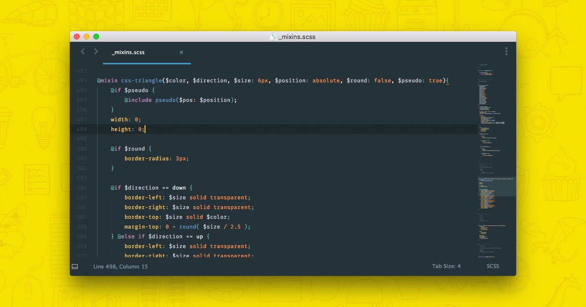
4. CSS triangles
This mixin takes all the hassle out of creating that triangle you'll see coming out of most traditional tooltips, all without images, you just specify it's colour, how big you want it, the direction it's going to come out of your element and you're done!
@mixin css-triangle($color, $direction, $size: 6px, $position: absolute, $round: false){
    @include pseudo($pos: $position);
    width: 0;
    height: 0;
    @if $round {
        border-radius: 3px;
    }
    @if $direction == down {
        border-left: $size solid transparent;
        border-right: $size solid transparent;
        border-top: $size solid $color;
        margin-top: 0 - round( $size / 2.5 );
    } @else if $direction == up {
        border-left: $size solid transparent;
        border-right: $size solid transparent;
        border-bottom: $size solid $color;
        margin-bottom: 0 - round( $size / 2.5 );
    } @else if $direction == right {
        border-top: $size solid transparent;
        border-bottom: $size solid transparent;
        border-left: $size solid $color;
        margin-right: -$size;
    } @else if  $direction == left {
        border-top: $size solid transparent;
        border-bottom: $size solid transparent;
        border-right: $size solid $color;
        margin-left: -$size;
    }
}
5. Font styles
Take the pain out of setting styles for a font. (This assumes you have already included the font), set your fallback font once and you never have to worry again.
@mixin font-source-sans($size: false, $colour: false, $weight: false,  $lh: false) {
    font-family: 'Source Sans Pro', Helvetica, Arial, sans-serif;
    @if $size { font-size: $size; }
    @if $colour { color: $colour; }
    @if $weight { font-weight: $weight; }
    @if $lh { line-height: $lh; }
}
6. Placeholders
They're a pain as you have to set the style in all the separate formats, this sorts it for you.
@mixin input-placeholder {
    &.placeholder { @content; }
    &:-moz-placeholder { @content; }
    &::-moz-placeholder { @content; }
    &:-ms-input-placeholder { @content; }
    &::-webkit-input-placeholder { @content; }
}
Just in case there are people how aren't used to using @content here is a usage example:
input,
textarea {
    @include input-placeholder {
        color: $grey;
    }
}
7. Media queries
A massive time saver! You can just use pixel values but we have some default breakpoints setup that work too, another time saver while keeping your breakpoints consistent.
$breakpoints: (
    "phone":        400px,
    "phone-wide":   480px,
    "phablet":      560px,
    "tablet-small": 640px,
    "tablet":       768px,
    "tablet-wide":  1024px,
    "desktop":      1248px,
    "desktop-wide": 1440px
);
@mixin mq($width, $type: min) {
    @if map_has_key($breakpoints, $width) {
        $width: map_get($breakpoints, $width);
        @if $type == max {
            $width: $width - 1px;
        }
        @media only screen and (#{$type}-width: $width) {
            @content;
        }
    }
}
The example below showing the padding and font-size increasing once the viewport gets over 1024px.
.site-header {
    padding: 2rem;
    font-size: 1.8rem;
    @include mq('tablet-wide') {
        padding-top: 4rem;
        font-size: 2.4rem;
    }
}
8. Z-index
While technically this is just a pure function, but I felt it's worth being on the list as it's so easy to loose track of your z-index values when working in several different files, so we created this so that we could store them in one place for easy editing/recording. Just place this snippet in your main variables/settings.scss file (needs to be imported before any of your other files that reference a x-index of course).
@function z($name) {
    @if index($z-indexes, $name) {
        @return (length($z-indexes) - index($z-indexes, $name)) + 1;
    } @else {
        @warn 'There is no item "#{$name}" in this list; choose one of: #{$z-indexes}';
        @return null;
    }
}
$z-indexes: (
    "outdated-browser",
    "modal",
    "site-header",
    "page-wrapper",
    "site-footer"
);
Then where ever you're wanting to use a z-index value, name it the same as your class and add in it into your variables/setting file, like below. You'll never have a "z-index: 99999999;" headache again.
.site-header {
    z-index: z('site-header');
}
9. Hardware
Simple and effective for when you need to trigger hardware acceleration for some animation, keeping everything fast, slick and flicker-free.
@mixin hardware($backface: true, $perspective: 1000) {
    @if $backface {
        backface-visibility: hidden;
    }
    perspective: $perspective;
}
10. Truncate
Adding Truncation to an element isn't as simple as it should be, although it is with this handy time saver, meaning when you include the mixin, you only have to specify your boundry with a max width value, happy days!
@mixin truncate($truncation-boundary) {
    max-width: $truncation-boundary;
    white-space: nowrap;
    overflow: hidden;
    text-overflow: ellipsis;
}
That's not all
We've got loads more where that came from, from quickly adding antialiasing to text, or removing the ability to select text in an element at all (useful for navigations or buttons etc). You can find them all in our mixins file (which is part of the Engage Front End Baseplate over on github.