You’re wrong, there is a fold
Roughly a 4 minute read by Simon
Before you get angry, and now that I’ve got your attention, I don’t really believe there is a fold when it comes to web design. However, there is a long-standing trend of only concentrating on screen width when designing and building websites, and simply ignoring the height of something.
Responsive design
By now, whether you’re in the industry or not, you will likely have heard of the term responsive web design. Even if you haven’t, if you use the web often enough, you’ll definitely have experienced it.
In a brief summary, responsive web design is a website that responds to the size of the browser/device, typically changing and adapting to the space available to provide the best user experience (UX) possible.
Designing for width
As mentioned, designing for width is a common thing. But why?
I’m going to generalise, but a typical web designer or developer will be working on a massive screen. Every time you see photoshoots of a new swanky agency office, everyone has at least 24-inch+ screens. Here at Engage pretty much every designer and front-end developer is working on a 27-inch screen during their typical working day. Even at my first web design job 8 years ago I had dual 24-inch screens.
So why’s that a problem?
The problem is that when you’re designing or developing on a large screen, it’s too easy to ignore smaller screen sizes. The most common resolution in the world is a typical laptop screen, which is only 768 pixels in height. Take into account browser chrome and toolbars, you’re likely left with a screen height of around 600 pixels. In comparison, Chrome on my 27” iMac has 1200 pixels of vertical real estate.
When analysing different websites and development frameworks, a desktop or larger screen is often considered to be 1200 pixels wide or above (give or take a few pixels). So when the design has at least 1200 pixels of width available, we bump up the design to typically it’s biggest version. Unfortunately, it’s not good enough to be that simplistic.
While many single elements on the screen won’t have a negative impact on UX alone, combine them all together, you can quickly present the user with an overwhelmingly large experience.
We all mostly agree that there is no “fold” when it comes to web design. Users scroll. End of. However, if a user has to scroll to see on focal element of a design, it’s probably too big.
Here’s a few examples of how designing purely for width can cut off content unnecessarily.
Spotify - Font sizes could be reduced to accommodate the slider pagination and “learn about Spotify” link

Rodesk - Could easily reduce the heading font-size to cater for shallower screens

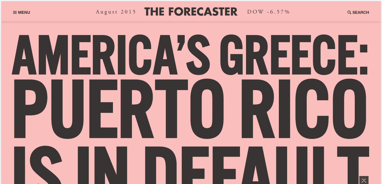
The Forecaster - typography too large for a typical laptop screen, spoiling the experience slightly
Containment - Content does fit on screen, but initial load and content positioning could be improved

Code and Pepper - Alternative example. The font size is calculated by height, but then doesn’t take into account width

So how do we fix this?
The simple solution is to consider browser height when designing and building components of a website. Much like taking the mobile-first design approach (you do take a mobile-first design approach, right?) in that we increase sizes and change design as the screen gets wider, we should also consider height in the equation.
When it comes to build (or design in the browser), instead of just having a bunch of min-width media queries, throw in some min-height ones too. You don’t even need to include that many to make significant improvements to your build.
Another, now well-supported, option is to utilise the Viewport Width (vw) and Height (vh) properties to set the size of various elements (e.g. 50vh) is 50% of the browser height.
Here’s a couple of examples that handle height well
Bolden - introduction text scales with width and height

Huffington Post article - responsive typography works well

The changes don't even have to be dramatic
Here's a couple of subtle changes in some of our projects.

In conclusion, consider height with just as much importance as width, it can only improve the experience for your users.