Where we’re going, we don’t need pixels...
Roughly a 6 minute read by Will
Technology is evolving rapidly. When I first started working in the web industry the concept of responsive design was unheard of, mobile phones had mostly useless WAP browsers, Flash was cool and people laughed if you Dribbbled.
Now? Mobile phones have ultra-high definition screens with resolutions greater than the average laptop and the laptops with similar technology have resolutions that 6 years ago would require a screen the size of a small car. Pixels are now so small that our eyes can barely see them and soon they will be just another arbitrary number like the contrast ratio. The pixel as we currently understand it is not long for this world!
Tiny, tiny pixels
There are lots of buzzwords for this technology - Retina, 4K, UHD, 1280p etc - but it all boils down to how many pixels there are per inch. Above 300 PPI, the human eye can barely make out the individual pixels. This is the point we have reached now. I’m sure consumerism and our love of the aforementioned buzzwords will feed the onward march up past 400 PPI, but really, anything more than that and it doesn’t actually matter.
My prediction is that in about 4 or 5 years time we will begin to see technology that makes pixels irrelevant.
For a replacement, my first thought is to the millimeter. Previously - although possible - this wasn’t feasible as display and browser technologies were simply not advanced enough. For example, 10mm is supposedly 37.79px. A number like this would either need rounding (and cause horrible layout issues) or for browsers to render sub-pixels (and subsequently lots of blurred edges). This is where screens with greater PPI come in to play: Once the numbers head past the natural abilities of the human eye you won’t be able to see those blurry edges anyway.
The mm isn’t actually that precise though (compared to your average pixel, it’s quite a beast) so we will have to use the brilliant and underused rem to calculate sizes from a root value. For example: If we set the body font size to 5mm, 0.1rem would equal .5mm. I think that’s precise enough for most, and it wouldn’t be hard to go further if you needed even more accuracy.
Okay, that’s interesting but why bother?
There’s already a vast amount of variation in the pixel size, but we still use them as the measurement to build upon. So far this hasn’t been too much of a problem, but with smaller and smaller pixels it will become increasingly more apparent. The creators of high PPI devices know this and have kindly used pixel scaling to make our lives easier. But this is only a temporary solution. We will have to switch to a real-world measurement.
As resolutions get higher the pixel values we set will become gradually increasing multiples of the actual physical pixel size. And I don’t know about you, but I want to use all those extra pixels, or at least have the choice. Why give us the resolution if we’re only going to use half, a third or even a quarter of it?
At some point our operating systems will have to adopt the same approach (in a more robust fashion than they currently do). Here’s a lovely illustration explaining why:
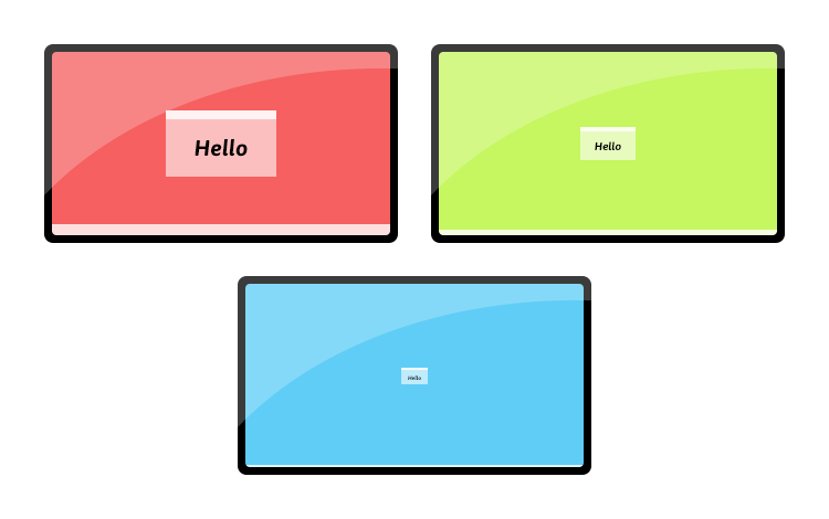
All three screens are the same physical dimension. The red screen is the current standard PPI. The green screen is the next generation (those buzzwords again, UHD, 4K, Retina) and the blue screen is the near future (MUHD, 8k, Double-Retina perhaps).
What does this all mean for the web?
Polyfils and media queries
We are in for a rough ride. The challenges of Internet Explorer are going to seem minor in comparison. Once operating systems and display manufacturers start making the switch we will have to simultaneously support pixel and mm based technology on screens ranging from about 60mm (phones) to 3000mm (TVs). Our lives are going to be an absolute nightmare of media queries and polyfils.
Some people might suggest we leave it up to the hardware to interpret our pixel values, but that’s just lazy - and will cause all sorts of problems - embrace the future!
Vectors, everywhere!
If we don’t want bandwidth to become an issue, we’re going to have to start relying on vectors a little more. SVG’s will become the image format of choice. We already have great abilities with CSS - rounded corners, shadows, gradients really help take some of the weight out of a page - but CSS can only do so much.
Effortless scaling
Very few people really browse the internet on their TV at the moment, but with Microsoft, Apple, Sony and now Valve all currently ‘battling for your living room this is about to change.
This poses a problem though: We sit quite a long way from the screen. The current solution is the browsers ability to scale a page up or down based on the user preference. But with pixels the size that they are at the moment and the majority of the web still built on a foundation of bitmaps and low resolution images this is a blurry experience. However, when we are resolution independent it won't even be an issue.
Whether the operating system takes care of the scaling at a base level or individual applications are left to sort things out, it doesn’t matter. With a web built to scale, everything will always look great.
Bye bye Photoshop
We currently use Photoshop for all our design work - it makes sense for now - the web is still based on pixels. When all that changes though, Photoshop probably won’t (it is photo editing software after all). I refuse to use Illustrator, it simply isn’t a good or suitable tool for web design and I doubt Adobe will ever change that. Luckily apps like Sketch are being created and moving very swiftly in the right direction.
I’m looking forward to the future
So, I’m all for it, working using real-world measurement makes sense to me and shouldn’t actually be too much of a change. The transition will be tricky, but I enjoy a challenge. And once we really understand what we can do and start to take full advantage, the web is going to look so crisp and shiny.