15 website accessibility tips & solutions
Roughly a 20 minute read by Simon

TL;DR Accessible websites are successful websites
In this handy guide, we’ve put together our top tips for website accessibility from our amazing team of developers, designers and general website experts. Keep reading to learn more about making your site as accessible as possible and tap into new and loyal customers your competitors have forgotten.
What is website accessibility?
So, before we dive into our list of web accessibility solutions, let’s talk about what we actually mean by accessibility. Well, quite simply, it’s making sure that your design and content can be used and consumed by most people without needing to adapt it, while also supporting those who do need to adapt things.
This includes people with:
- impaired vision;
- motor difficulties;
- cognitive impairments or learning disabilities;
- and deafness or impaired hearing.
What are some ways users can adapt websites?
In order to make browsing the web as easy as possible, some users will use:
Screen readers: software that lets a user navigate a website and reads the content aloud to the user.
Screen magnifier: a tool to effectively increase the size of the content by zooming into the page.
Braille display: a box with a line of braille cells. Pins in each of the braille cells move up and down to allow users to read a line of braille text. They range in size from 12 cell lines to 80 cell lines.
Speech recognition: software that enables a program to process human speech into a written format.
Built in browser tools: browsers have a handy set of tools built in that can assist people with adding their own preferences, such as default font sizes, zoom options, default colours, backgrounds, and languages.
How vital is website accessibility?
Website accessibility has never been more important than it is today. According to the World Health Organization (WHO), “an estimated 1.3 billion people – or 1 in 6 people worldwide - experience significant disability.” So, what does this mean?
This means, if your website is not accessible, people may struggle to use it, and some people won’t use it all because they simply can’t. There are three stand-out reasons why you should make sure your website is accessible for everyone:
Social
People who are living with disabilities are further marginalised by not being able to access content online. By taking steps to increase digital inclusion on your website, you are demonstrating how you care about your customers and want to provide the best experience possible.
Economic
You can reach a larger audience by ensuring website accessibility. If users with disabilities reach your site and are unable to access the content, they are more likely to leave and find a website that is accessible to them.
This also has an effect on brand awareness and loyalty. According to Purple Tuesday, a global social movement committed to improving the customer experience for disabled people and their families, a massive “70% of disabled people will NOT return to a business after receiving poor customer service.”
Legal
In 2010, the UK (excluding NI) replaced the 1995 Disability Discrimination Act with the Equality Act (EQA). This meant that UK goods and service providers (both public and private sector) have a legal obligation not to discriminate against people based on a number of protected characteristics - including disability.
The EQA doesn’t outline the technical accessibility requirements, but for best practice, companies should follow the Web Content Accessibility Guidelines (WCAG) set by the Web Accessibility Initiative (WAI).
These guidelines were developed with the goal of providing a single shared standard for web content accessibility that meets the needs of individuals, organisations, and governments around the world.
According to the Web AIM Million accessibility analysis of the top 1,000,000 home pages, 96.8% don’t meet the WCAG standards. The top three issues detected on these homepages were low contrast text, missing alt (alternative) text for images & empty links (hyperlinks which have no meaningful text to explain where the link directs to).
One particularly high-profile case of a website not following these guidelines was in 2019. Beyoncé’s entertainment company was sued over the lack of accessibility on her website. The main issue being that none of the images had alt text, which stops screen readers from explaining what is on the page to the user.
Website accessibility testing
There are two ways you can start looking at your website’s accessibility:
- Perform the checks manually.
- Use a tool created specifically to test your website for you.
If you’ve had a chance to take a look at the WCAG already, you’ll know there are A LOT of guidelines, and checking these manually can be incredibly time-consuming.
On the other hand, the tools available online are fast, free and easy to use - but not comprehensive. That’s why the best route is to use a combination of both.
Understanding the difference between A, AA and AAA accessibility compliance
Throughout this list of website accessibility tips, we’ve linked to some handy sites to give you even more support. As you’re exploring these sites, you’ll likely come across someone mentioning “double A” or “triple A” website accessibility compliance. But what exactly does it mean?
The higher the level (the more A’s), the more strict the requirements. Achieving level A is pretty straightforward, whereas achieving AAA is a lot more involved and requires more effort. Double A (AA) is the most common target when aiming for an accessible website.
15 Top tips for website accessibility
I know, I know, get to the good stuff, the actionable website accessibility advice.
So far, while this article has been filled with some pretty exciting stuff - laws, jargon, acronyms a plenty, let’s dive into why you’re here with our 15 top tips for website accessibility…
1. Choose a content management system with accessibility in mind
If you have a CMS-driven content populated website, then a CMS built with accessibility in mind can make a huge difference, particularly to the end user.
Some things to ask yourself are, can the editor of pages and content add the appropriate heading types (h2, h3, h4 etc.), use the correct HTML for ordered or unordered lists and create accessible tables?
Another often overlooked feature in a CMS is the ability and ease of adding alt text for images for users of screen readers. Some CMS can make the process harder than it needs to be - and if there’s a lot of time or effort needed, it can quickly be discounted as ‘not worthwhile’.
Engage’s go-to CMS of choice is Craft CMS. Beyond being an amazing and simple to use CMS, it really does tick the boxes for us when it comes to accessibility. Craft don’t simply have an accessible CMS, they also like to blog about it too. From plugins to target sizes, you can take a deep dive into accessibility with their up-to-date pondering.
2. Structure your page logically using headings
If you’re thinking, of course, we already use headings! Then awesome, you’re already adding some structure to your content. It’s worth considering, though, if the page is structured as well as possible for screen readers. By using the headings in the correct order, you’re explaining the content logically, not just for screen reader users, but search engines too.
Here are some bonus quick tips for accessible page structure:
- Avoid using a <h1> for anything other than the title of the website or page.
- Don’t skip heading levels (<h1> to <h3>), this jump appears to screen reader users that content is missing.
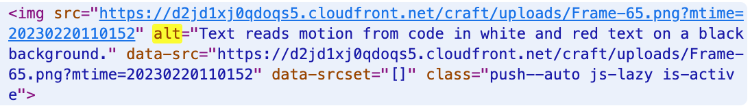
3. Include descriptive alt text for images
As we mentioned before, alt text for images is sometimes viewed as an extra optimisation that can be added ‘if you have the time’. However, they are vital in helping screen reader users to understand the message conveyed by the use of images on the page.
This becomes even more important when considering infographics that include key messages for your user.
Bonus tips:
- If your image includes text of any kind, this should also be included in the alt text.
- If an image is used as a link, the screen reader will read the file name, so if you don’t plan to optimise your alt text, make sure you consider your image file names and try to make them as descriptive as possible.
4. Give hyperlinks unique and descriptive names
Speaking of links… think about the text that you use in your links. Ideally, you need to make sure that the text properly describes where the link will go.
Using “click here”, while quick and easy to implement, is not descriptive, and is ineffective for a screen reader user. Visually impaired users are able to use their screen reader to scan for links on a webpage, which means that the link is often read aloud without any context.
For example,
“Take a look at Motion Designer Ollie’s blog, Top Tips for Creating Wiggle Expressions in After Effects.”
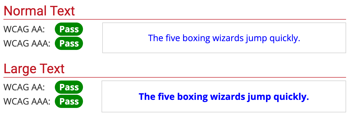
5. Consider your colours
According to Colour Blind Awareness, “Colour blindness (colour vision deficiency, or CVD) affects approximately 1 in 12 men (8%) and 1 in 200 women in the world. In Britain, this means that there are approximately 3 million colour-blind people (about 4.5% of the entire population), most of whom are male.”
Obviously, brand considerations have to be made when creating your website. Having said this, the most common colour deficiency is red-green. Therefore, by using only these colours, you could be preventing this group of users from understanding your message and eventually converting.
Contrast and colour use are vital to accessibility. The guidelines on contrast are arguably complex and can easily confuse web content creators and web accessibility evaluators. To learn more about contrast for accessibility, take a look at the Colour Requirement Article from the WebAIM.
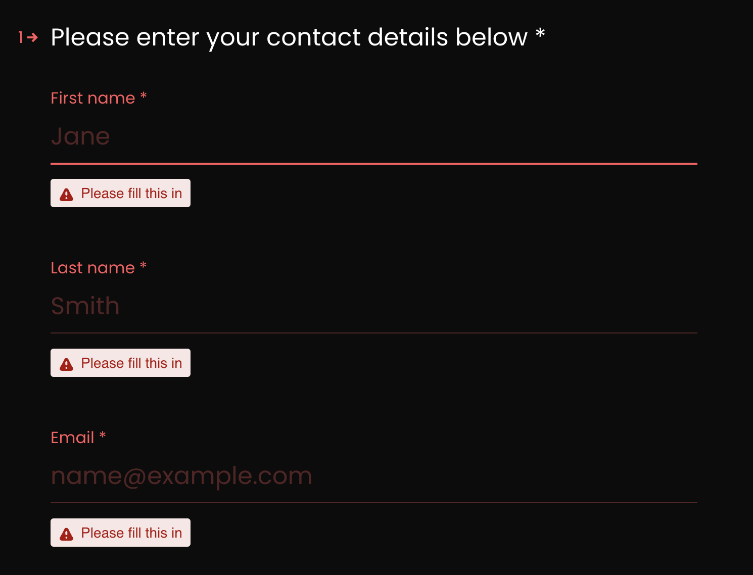
6. Design your forms for accessibility
We’ve all been there, filling out a form on a website, and it feels like you’re jumping through hoops, or adding the wrong information and having to keep going back to re-submit.
This can be an even more laborious process for those who use screen readers. When designing your forms, you should ensure each field has a well-positioned, descriptive label. For example, if you need the customer to fill out their name, on the field it should read Full Name or have two separate fields for First Name and Last Name.
To do this, you can use the <label> tag or an ARIA property to associate the label text with the form field.
For keyboard only users, make it possible for people to tab through each field or section of the form easily.
It’s also worth grouping related or similar fields in the form together to make the data more organised for screen readers to keep track of progress.
If you have required fields, make sure you label them as such, and configure them to alert the user to this. If you have already added visual indications such as asterisks this is perfect for sighted users, however, some screen readers won’t acknowledge them.
To indicate that a field is required to a screen reader, add ARIA required=”true” and ARIA required=”false” for optional fields.
Once the user has reached the end and clicked to submit their form, they should be alerted to submission confirmation. If error counts are included in the page title after they have submitted, the user will be informed straight away and will be able to rectify them quicker.
When a user submits a form with errors or omissions, re-displaying the form and only indicating the fields in error is insufficient for some users to perceive that an error has occurred.
The best practice, suggested by the Web Accessibility Initiative, is to include a message or alert that the form is not functioning correctly. It is also suggested to include an error notification in the page title, since a screen reader user is likely to believe the page was submitted correctly and will continue to navigate to another page as soon as the new page is returned instead of reading the main content area of the page again.
7. Use tables for tabular data, not for layout
When a screen reader encounters a table, it lets the user know how many rows and columns there are, this can distract the user from the content. They are also known to read content in the incorrect order - pesky little screen readers!
Our best practice suggestion is to use CSS for presentation. If a table has to be used for displaying data, use headers for rows and columns to provide context of the relationship between them. You can also add HTML5 table captions to give more information.
8. Make content accessible by the keyboard alone
Some people are unable to use a mouse or a trackpad, and will have to use the keyboard tab and arrow keys to access the content of a webpage.
This means that content needs to be structured logically as mentioned in tip #2, so that the tab order reflects the visual order.
If you have pages which are very long and contain lots of content, they should be broken up with jump lists or anchor links, plus an option to skip to main content should be available at the top of each page.
To test how easily accessible your pages are to keyboard only users, have a go at navigating your site without the mouse or trackpad.
A further point to consider is to avoid using elements that only activate when a user hovers over items with a mouse, as keyboard-only or screen readers users will not be able to activate them.
9. ARIA roles: when are they necessary?
You might remember from tip #6 about web form accessibility that ARIA or (Accessible Rich Internet Applications) can be used to add accessibility information to elements that are not natively accessible.
While ARIA can be incredibly useful, we should add a caveat here with a few extra notes:
- You should always use native HTML elements when they are available.
- As a general rule, the Web Accessibility Initiative states that “no ARIA is better than bad ARIA [and] incorrect ARIA misrepresents visual experiences, with potentially devastating effects on their corresponding non-visual experiences.”
- Many functions that used to require ARIA attributes are now implemented in HTML5. For example:
- Use the native HTML button tag instead of the ARIA role of button.
- Use the HTML label tag instead of aria-label or aria-labeledby.
- Use the HTML 5 nav tag instead of the ARIA role of navigation.
It is not sufficient to only add ARIA attributes in order to make complex widgets accessible, as it only affects people using assistive technology not those who only use a keyboard. In which case, you still need to set up your interactions and behaviours using JavaScript.
Two effective and appropriate uses for ARIA include, adding an alert to let screen readers know about any dynamic page changes, such as stock tickers and search filters; and making widgets such as date pickers accessible to screen reader users.
10. Dealing with dynamic content
Dynamic or adaptive content refers to the content that changes on the page depending on user behaviour, preferences and interests.
An example of this kind of content is when you are provided with suggested items on an ecommerce website based on your browsing history or recent purchases.
Some drawbacks for dynamic content for accessibility include how if the content on a page updates without the page being refreshed, screen readers may not be aware.
Keyboard traps
It’s also common for keyboard-only users to become trapped in a loop within page overlays of dynamic content. There should never be a keyboard trap that a user can’t get out of by pressing the ‘Esc’ key, with the focus returning to the previously focused element.
Video and audio content
If you have video or audio elements on your page, ensure that they don’t autoplay, as it can be alarming for those using screen readers and drown out the voice of the screen reader. These elements should also have options for closed captioning and transcripts available for the hearing impaired.
If there are slideshows, all the images should have alt text and be able to be navigated by using the keyboard.
Widgets
Widgets such as search bars and clock widgets should also be tested for accessibility, including the size of the text within it.
Flashing content
Flashing content can be triggering for users who suffer with seizures from photosensitivity, and images that move on the page can be difficult to process for some users.
To help with this issue, you should give users the chance to pause an animation that lasts longer than 5 seconds. The WCAG also states that elements shouldn’t flash more than 3 times every second.
11. Identify language of text
Identifying the language of the entire web page or document, as well as its individual parts, helps to ensure that screen readers will correctly pronounce the content.
According to the WCAG it also “allows braille translation software to substitute control codes for accented characters, and insert control codes necessary to prevent erroneous creation of Grade 2 braille contractions.”
12. Avoid tiny fonts
It’s good practice to use a decent-sized font in case users are unaware they can increase the font size with browser hotkeys. The WCAG requires pages to be able to be zoomed in to 200% and be useable without any assistive technology. There’s no official number - but a generally accepted minimum font size for content is 16px.
It’s also worth noting that while some users will be accustomed to using CMD/CTRL and ‘+’ to enlarge the page, some will choose to resize just their text. To make sure line-height adjusts proportionately, and you retain readability, you need to define your CSS line-height using relative units or unit-less values.
According to the accessibility guidelines, while the default line height in browsers is 1.2, it should actually be 1.5 within paragraphs in blocks of text.
13. White space
White space, or negative space as it is sometimes called, reduces clutter and provides definition to the content. While it may be used by designers to enhance page elements, it can also help users navigate the page.
As the WCAG mentions, white space has been shown to ease reading difficulties and improve understanding of content for those with cognitive and learning disabilities. This is supported by the Principles of Gestalt:
“Elements are perceived as part of a group if they are located within the same closed region… Objects that are closer together are perceived as more related than objects that are further apart.”
14. Provide a transcript
We mentioned providing a transcript within tip #10, but it’s more than just making audio content accessible for users who are deaf-blind. You are also ensuring those who have low Internet bandwidth can access the content without having to play the video.
Remember that a transcript’s purpose is to provide information to users who can’t get it from the video or audio file alone. Consider adding headings, an overview or links if appropriate.
According to the NHS, “in the UK, more than 2 million people are living with sight loss. Of these, around 340,000 are registered as blind or partially sighted.” This is a great argument for you to spend the time creating a transcript, ensuring those who are using screen readers can access the content.
15. Testing, testing, testing!
If you’re starting your mission to make your website as accessible as possible, what better way is there to see the progress you’re making than testing for yourself?
Think about all the tips we’ve mentioned in this article and work through it as a checklist! Do your images have alt tags, is the content structured well?
Ask yourself, can I access all the elements on my site with a keyboard? Try navigating popular user journeys, are there any rollover menus which would be missed using a keyboard? Can you close dialogue boxes using the ‘Esc’ key?
Test your site with a screen reader to find any issues with dynamic content, reading order or spellings.
It’s important to note that - much like the difference between different desktop browsers - different assistive technologies have their own limitations, quirks and differences.
Tools to use to help you access and improve your website’s accessibility
If you’re ready to start checking your website and how it stacks up against the guidelines, check out the following web accessibility tools to get you started!
- Contrast Checker: You can enter a foreground and background colour in RGB hexadecimal format, or choose a colour using the colour picker, and it will tell you your contrast ratio.
- Web Accessibility Evaluation Tool: An automated checker for web accessibility that also includes human evaluation of web content.
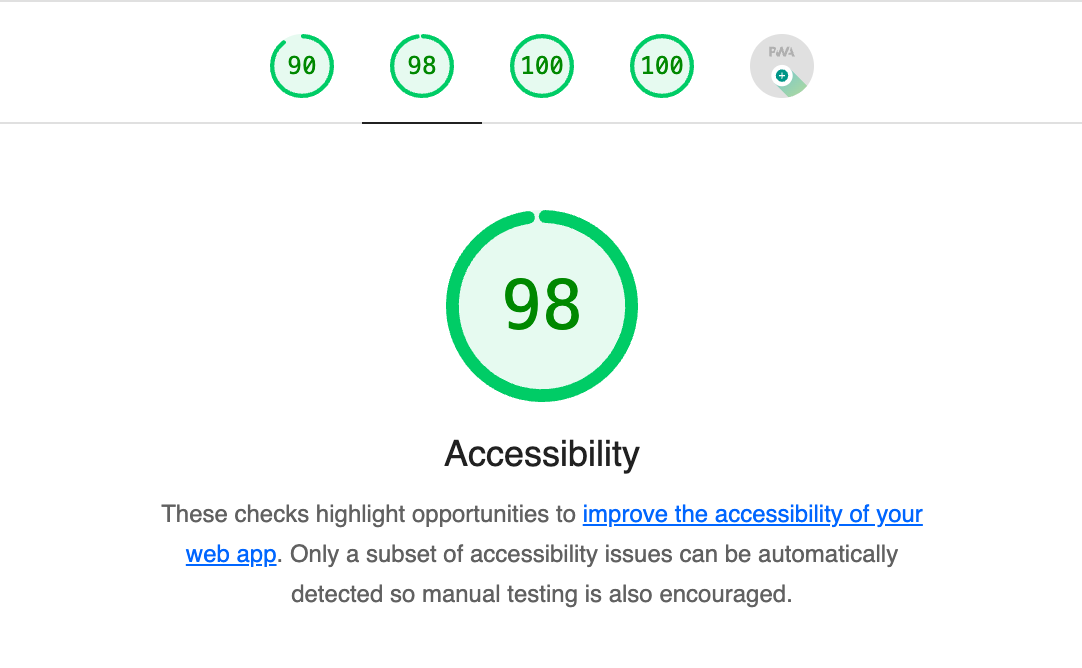
- Lighthouse: A Google extension which can be used for improving the performance, quality, and correctness of your website & apps. While not conclusive, it highlights the overall accessibility rating of your website out of 100.
WCAG 2.0 vs. WCAG 2.1: Mobile accessibility highlights
WCAG 2.0 was published as a final W3C Recommendation Web Standard on 11th December 2008. The web, as you can imagine, has come a long way since then. On 5th June 2018, WCAG released an updated version of the specification, specifically to include new requirements geared towards mobile.
The updated version included, but not limited to:
- Speech input, including key shortcuts.
- Pointer, gestures, click/target sizes (tapping things with your finger has less precision than a mouse pointer).
- Input methods (so the appropriate keyboard is presented, depending on input type, e.g. telephone numbers, names, email addresses, URLs etc.)
- Device settings (portrait vs. landscape).
- Other standards such as reflow, text spacing, hover/focus states were also updated.
Finally…
Ultimately, if you take nothing else away from this article - you’ve learnt how important website accessibility is, for your customers, but also for your business and the effectiveness of your website.
Guidelines and solutions to website accessibility are being updated and streamlined regularly, which is why we’d suggest it becomes part of all website owners’ review processes. We haven’t explored all the technical solutions to getting that AAA standard in website accessibility here (this blog would be enormous if we did!) but give us a shout if you do have questions that haven’t been answered - we’d love to hear from you.
At Engage, we’re passionate about creating, maintaining and growing websites for our clients that are accessible to all. If you have a project, don’t hesitate to get in touch.